About Daily Cusack
The daily blog of Andrew Cusack: a writer, historian, web designer, and volunteer with the homeless, handicapped, and elderly. Formerly of New York, Buenos Aires, Fife, and the Western Cape; I'm now based in London. read more

Blogs
- Rorate Caeli
- First Things blog
- Sancrucensis
- Ex Laodicea
- Millinerd
- American Conservative blogs
- Spoils of Egypt
- Sam Kriss
- Paraphasic
- Eunomia
- Irish Aesthete
- Classicist
News
- BBC News
- Daily Telegraph
- Spectator
- Catholic Herald
- First Things
- American Conservative
- New Criterion
- London Review of Books
- Frankfurter Allgemeine
- Neue Zurcher Zeitung
- ConservativeHome
- CapX
- Arts & Letters Daily
- Buenos Aires Herald
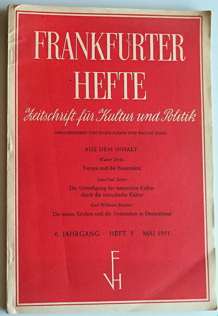
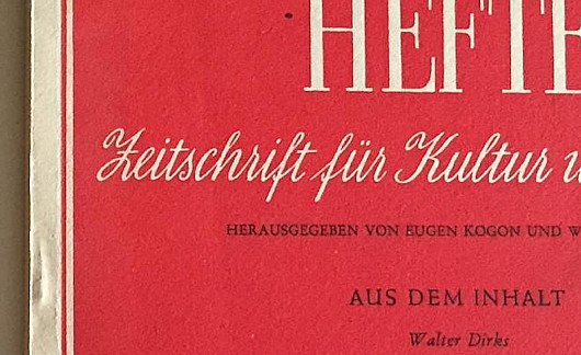
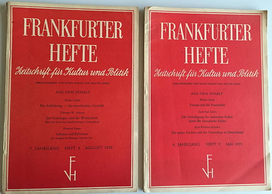
German typography and print design in the 1950s combined elegance and simplicity, as shown here in the front cover of Frankfurter Hefte, the political monthly founded by Eugen Kogon and others in 1946.
16 February 2016 6:00 pm | Permanent Link | 2 Comments »

Comments
Leave a comment
16 Feb 2016 9:34 pm
I agree with you wholeheartedly about German typography and print design of the post-war period (the Schott Messbuch is another good example) but I deplore your choice of the Frankfurter Hefte to illustrate your point. Had its nostrums prevailed Germany would never have experienced its Wirtschaftswunder but, like luckless Britain, would have stagnated in a pool of noxious socialism until at least the 1970s.
17 Feb 2016 10:37 pm
I was hoping no one would notice that, but should have known Hetterscheidt would.
But as my politics are Adenauer’s, I praise only the aesthetics of the Hefte.